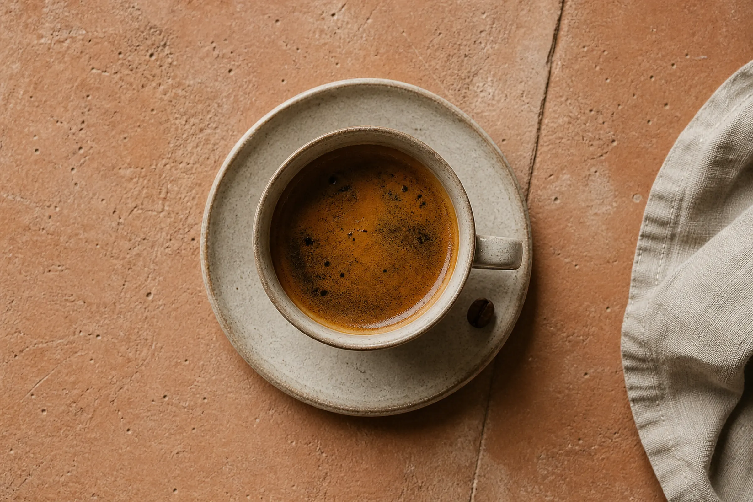
Slow roasted in Fresno. Brewed wherever you are.
Document №2026-OA-001
Prepared forFounder · Olive Avenue Coffee
TierPremium · $10,000
Essence
Who Olive Avenue Coffee is, who it is for, and the single sentence that explains the rest.
Positioning Statement
Olive Avenue Coffee is the Tower District's working-class specialty roaster — sourcing from Central Valley growers we can drive to, roasting in small batches that sell out by Friday, and pouring shots for the line cooks, nurses, and teachers who built this neighborhood before it was cool.
i.
Grounded
We are of this place. The Valley grows our suppliers, the Tower built our regulars, the roaster runs in a converted garage on Olive Ave. The brand never feels imported.
ii.
Considered
Every cup is a decision made twice — first by the roaster, then by the barista. The voice mirrors that: nothing is incidental, nothing is loud, everything is on purpose.
iii.
Generous
We serve hospitality workers at cost on Mondays. We name our origins. We tell the truth about every bean. The brand acts the same way it pours coffee — open hand, no apology.
Logo System
Six lockups, one monogram, and the rules that govern them. The Premium tier ships 160 files across format and color variants — what follows is the master reference.
Primary · Stacked
The signature mark. Use on packaging, signage, and at scale on the website. Never below 48px tall in digital, 0.5in in print.
Horizontal Lockup
For wide formats — email headers, web nav, business-card faces. Use when vertical space is at a premium.
Monogram · "OA"
For favicons, social avatars, embossed stamps, cup-bottom stamps, and any context where the full mark won't read. Always set in the brand serif at full weight.
Reversed · Bone on Espresso
For dark backgrounds — espresso-ink fields, hero photography, coffee bag fronts. Identical lockup, reversed contrast.
Clear Space
Minimum clear space around the primary mark is equal to the cap-height of the word Olive. Never crowd the lockup with competing copy, imagery, or rule lines. Generosity reads as confidence.
Minimum Sizing
Primary mark: never below 48px tall on screen, 0.5in in print. Monogram: never below 24px on screen, 0.25in in print. Below these thresholds, drop to the wordmark-only or skip the brand altogether.
Common abuses — don't.
Don't stretch the lockup.
Don't rotate the mark.
Don't add gradients, shadows, or glows.
Don't render in unsanctioned colors.
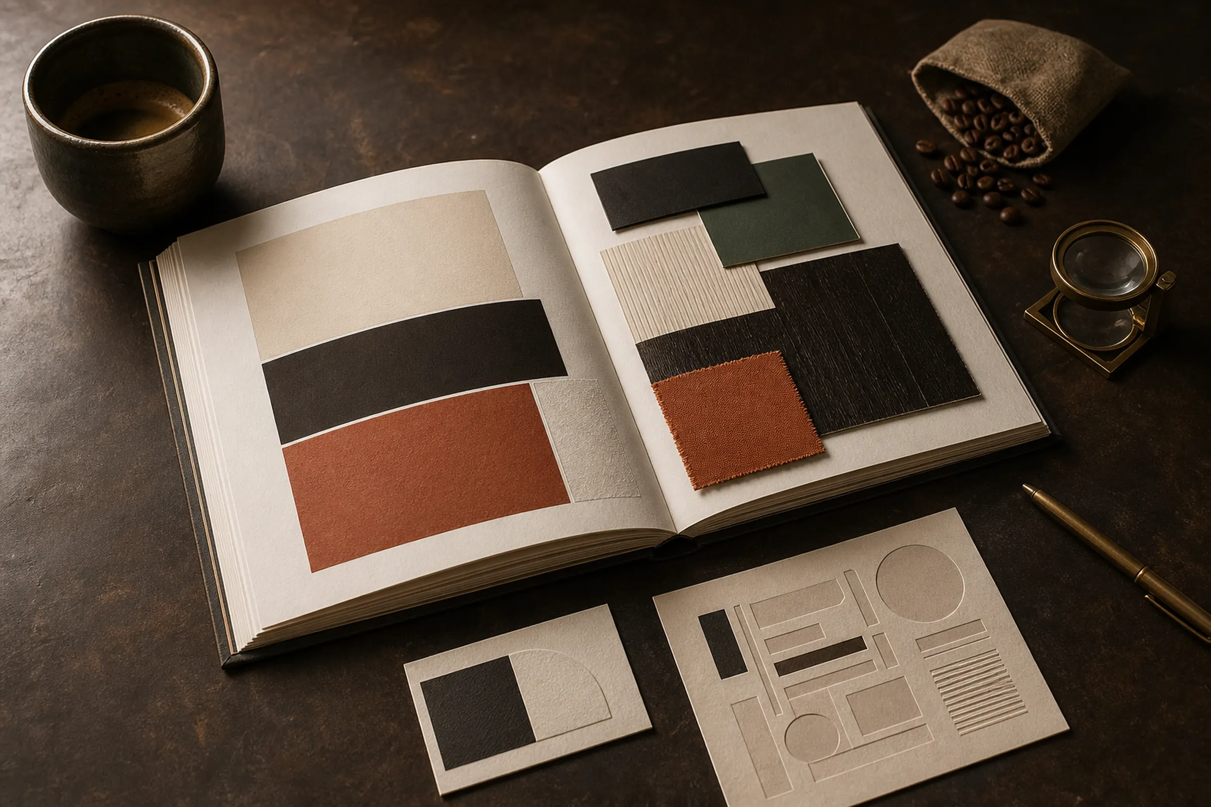
Color
Five colors total — three primary, two accent. Designed for warmth, restraint, and the natural materials of the trade.
01
Espresso Ink
Primary · Anchor
- HEX#1A1410
- RGB26 · 20 · 16
- CMYK0 · 23 · 38 · 90
- PantoneBlack 6 C
The brand's primary anchor — body type, logo mark, packaging fronts, hero backgrounds.
02
Bone Paper
Primary · Field
- HEX#F6EFE5
- RGB246 · 239 · 229
- CMYK0 · 3 · 7 · 4
- PantoneWarm Gray 1 C
Default background. Mimics warm-press paper stock. Use behind body type and as the dominant field in the brand book itself.
03
Tower Brick
Accent · Warm
- HEX#B85A3A
- RGB184 · 90 · 58
- CMYK0 · 51 · 68 · 28
- Pantone173 C
Named for the Tower District brickwork. Reserved for accent moments — section dividers, emphasis runs, single-origin bag labels.
04
Cypress
Primary · Secondary
- HEX#4A5E48
- RGB74 · 94 · 72
- CMYK21 · 0 · 23 · 63
- Pantone5605 C
A muted Central Valley green. Use for the secondary mark, decaf bag fronts, and the wholesale program.
05
Brass
Accent · Metallic
- HEX#A8773D
- RGB168 · 119 · 61
- CMYK0 · 29 · 64 · 34
- Pantone871 C (Metallic)
Reserved for embossed and foil moments — letterpress business cards, foil-stamped notebook covers, brass hardware in retail.
Ratio guidance. Espresso Ink and Bone Paper should account for 75–80% of any composition. Cypress can carry 10–15%. Tower Brick and Brass are accent-only — never more than 5% combined.
Typography
A two-family system — a heritage serif for display and a clean grotesque for body. Both selected for legibility on receipts and reverence on the cover of a book.
Aa
Mornings on Olive Avenue
Single origin, single batch, single shot.
ABCDEFGHIJKLMNOPQRSTUVWXYZ · 0123456789
Aa
A working-day coffee.
We roast on Tuesdays and Thursdays. Bags go out the door Wednesday and Friday. Anything still on the shelf Monday morning is on sale to staff at cost.
ABCDEFGHIJKLMNOPQRSTUVWXYZ · abcdefghijklmnopqrstuvwxyz · 0123456789
Type Hierarchy in Practice
Single Origin · Honduras · La Pintada
Notes of stone fruit, caramel, dried fig.
Washed process. Roasted medium-light for filter. Available the second Tuesday of every month while the harvest lasts.
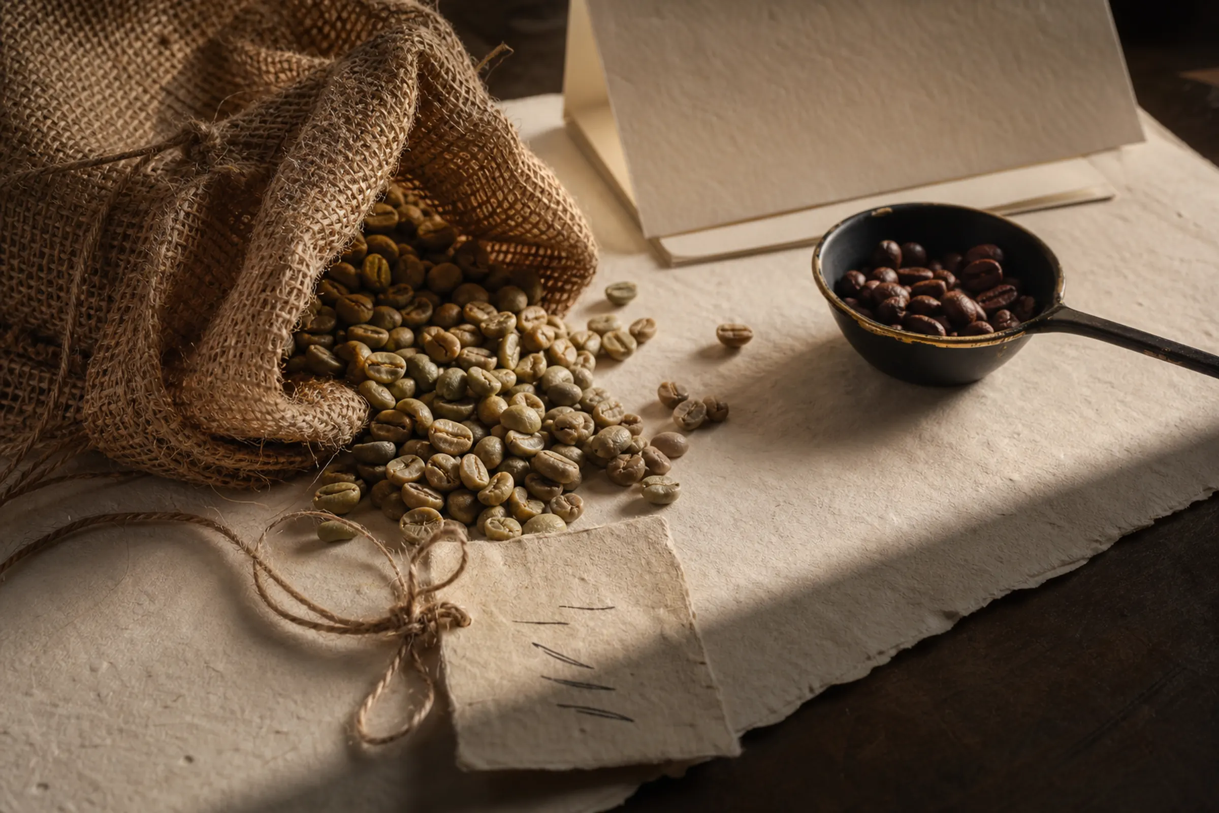
A working farmer in the cloud-forest at La Pintada hand-picks every cherry that arrives in our garage on Olive Ave. We roast it on Tuesday morning and it's poured by Wednesday lunch — that's the entire chain. The price on the bag covers his second harvest, our quarterly insurance, and the time it takes to do this right.
— Brewing guidance & farm cards inside every bag.
Imagery Direction
Photography reads as editorial print — physical materials, golden-hour light, no people's faces, no styled stock. The grower, the roaster, the cup, the room.
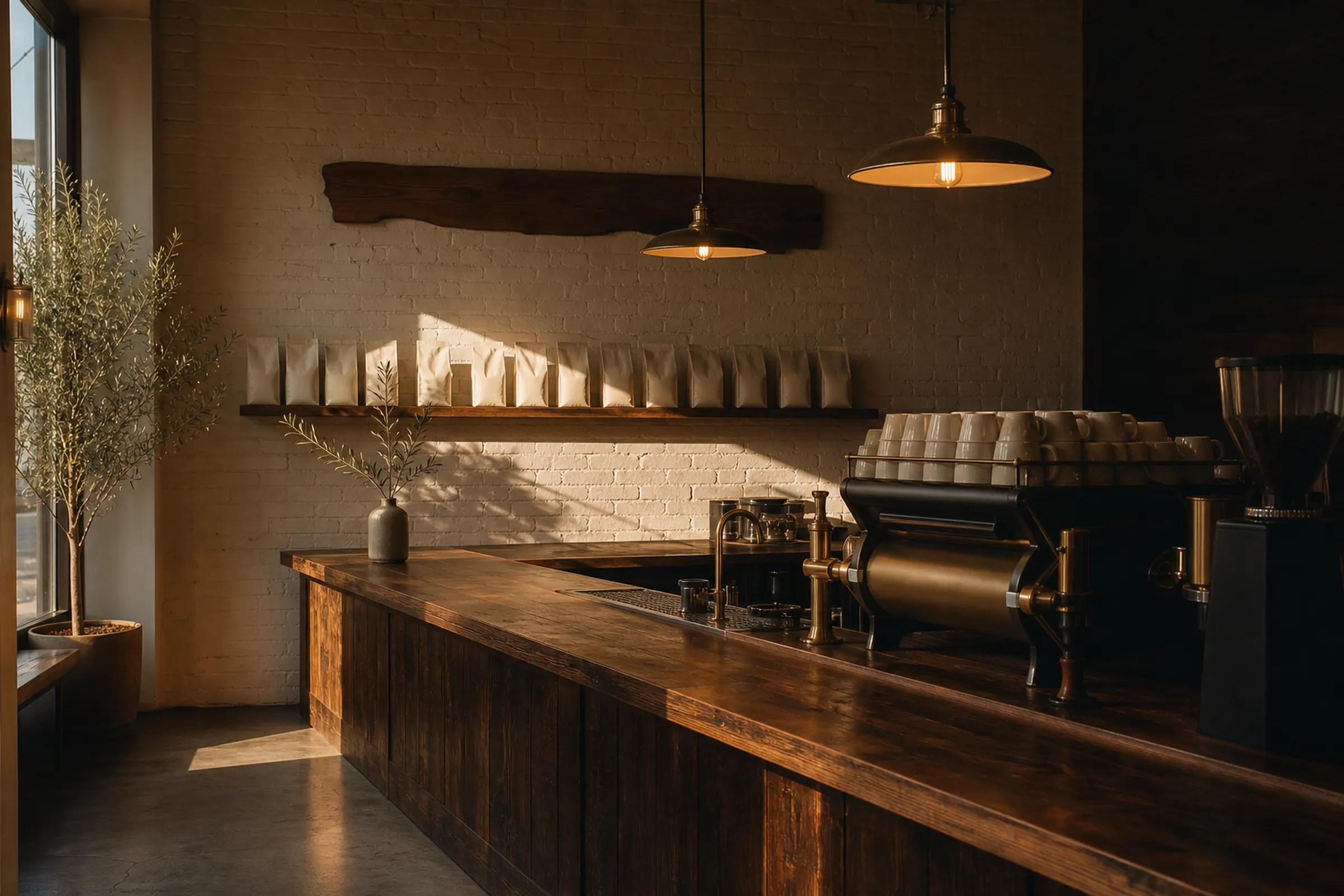
Do
- Editorial print mood — Cereal, Drift, Kinfolk, Apartamento
- Natural light, golden hour where possible
- Real materials — burlap, ceramic, wood, brass, paper
- Negative space — let the subject breathe
- The product or the place, not the brand performing
Don't
- Stock photography — Shutterstock, Getty, Adobe Stock
- People's faces (silhouettes and hands OK)
- Café-cliché styling — chalkboards, latte art hearts, neon "open" signs
- Oversaturated, postcard color grading
- Flat product-shot lighting against white seamless
Voice & Tone
Three voice attributes. One sentence per attribute. Four canonical example snippets that demonstrate them in the wild.
Plainspoken
No coffee-snob jargon. If a 14-year-old can't follow the sentence, rewrite it.
Sourced
Always name a farmer, a process, a date, a town. Specificity reads as honesty.
Generous
Tell people what we know, not what we want them to think. The reader decides.
Bag back · Single origin
Picked by Don Hugo in La Pintada on March 14th. Washed two days later. Roasted in Fresno on April 9th. Best between April 16th and May 10th — after that the cup gets quiet. Brew at 200°F, 1:16 ratio, 4 minutes if you're using a Chemex.
Social caption · Instagram
Tuesdays are roast days. The garage smells like the inside of a chocolate bar. If you're nearby and your dog needs a walk, come stand outside the open door for ten minutes. We won't charge you.
Email · Wholesale prospect
Hi — saw your kitchen on the Tower walk last month. We roast specialty in Fresno on Tuesdays and Thursdays. We have a couple of restaurant accounts already; the price is honest and the delivery is walking distance. If you ever want to taste, the door opens at 7. — Lee
Signage · Front window
Open since the alarm went off. Closed when the last bag is gone.
Applied Identity
The system, in the wild. Four canonical applications — packaging, retail signage, business card, social tile — rendered as production-ready mocks.
Application 01 · Single-Origin Bag
Letterpress-printed bone paper, Espresso Ink with Tower Brick accent stripe. Origin and roast date hand-stamped per batch.
Application 02 · Business Card
Lee Marin
Founder · Head Roaster
1142 N Olive Ave · Fresno CA
Letterpress on Crane Lettra 220lb stock. Bone Paper field with deep Espresso Ink impression and a Brass foil monogram on the reverse.
Application 03 · Retail Blade Sign
Hand-painted blade sign in Espresso Ink on bone-painted poplar, mounted on cast-brass hardware. Visible from the corner of Olive and Wishon.
Application 04 · Social Tile
1080 × 1080 canonical template. Caslon Italic Revival headline on Bone Paper, Tower Brick rule line, monogram bottom-right.
What ships at each tier.
This brand book is what the Premium tier delivers. Essential and Complete deliver subsets — same craft, less scope.
$5,000
Essential
Solo professional · single audience
- 60-file logo system (3 layouts × 4 colors × 5 formats)
- Lean voice guide (1–2 sentences per attribute)
- One-pager brand reference card (not the 30-page book)
- 1 round of revisions · 3-week delivery
Best when the brand serves one audience and ships fast.
$7,500
Complete
Standard local-brand scope · recommended default
- 120-file logo system (5 layouts + utility variants)
- Full voice + content pillars guide
- 20-page brand book PDF (everything above except applied gallery)
- 2 rounds of revisions · 4-week delivery
The right call for most local brands — full identity system, abbreviated applied gallery.
$10,000
Premium
Complex single entities · multi-audience
- 160-file logo system (6 layouts + sub-mark variants)
- Full voice + content pillars + sample copy + tone playbook
- 30-page brand book PDF + applied-mockup gallery
- Founder-narrative copy module included
- 3 rounds of revisions · 5-week delivery
This page is the Premium output. Complex businesses, multi-location, B2B + B2C.
You own everything we build for you. Every brand asset, every editable source file, every design master — yours on delivery. No license restrictions. No buy-out fees. No modification fees. If you ever leave, your brand walks with you.
End of brand book
Want one of these for your brand?
The brand book you just scrolled is a fictional example. The craft is real — every Premium tier ships this scope of work, delivered as a 30-page PDF + a folder of editable source files you own outright.
Start your brand build